

Why Most SaaS Dashboards Fail (And How to Design Ones People Actually Use)
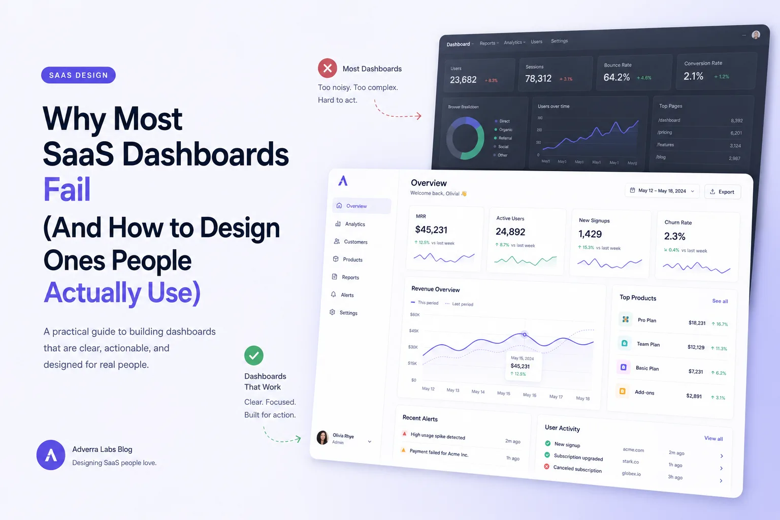
Every SaaS platform we've inherited from another agency has the same problem: a dashboard nobody opens after the first week. Not because the data is wrong — because nobody designed it to answer a question.
The pattern we keep seeing
Teams start with "let's show everything" and end up with fifteen charts competing for attention. Users glance at it once, don't find what they need fast enough, and go back to exporting CSVs into their own spreadsheet. The dashboard becomes a compliance artifact instead of a tool.
We've rebuilt enough of these to notice the same three mistakes every time:
- Charts before questions. The team picked visualizations before deciding what decision the dashboard should support.
- No hierarchy. Every metric gets equal visual weight, so nothing reads as more important than anything else.
- Stale by default. Data refreshes on a schedule nobody explains, so users stop trusting the numbers.
The framework we use instead
Before any UI work starts, we make the team answer one question for every proposed metric: what decision changes if this number goes up or down? If nobody can answer that in one sentence, the metric doesn't make the first version.
From there, we group what survives into three tiers:
- The headline number — the one metric that should be readable from across the room. Usually one, never more than three.
- The supporting context — two or three metrics that explain why the headline number moved.
- The drill-down — everything else, available on click, not competing for space by default.
This is the same triage we apply when we build BI dashboards and analytics tools for internal ops teams, not just customer-facing dashboards — the instinct to show everything is universal, and the fix is always the same discipline.
What this looks like in practice
On a recent build for a logistics client, the original ask was a dashboard with 22 charts. We shipped six. Margin per lane sits at the top because that's the number that changes what loads get accepted. Everything else — carrier scorecards, historical trends, exception logs — lives one click away. Usage went from a handful of logins a week to daily standing use by the ops team, because the first screen finally answered the question people actually had.
The takeaway
A dashboard isn't a report. It's a decision-support tool, and decision-support tools only work if they're ruthless about what they show first. If your team can't tell you what decision each chart supports, that's the fix — not a redesign, a cut.
SaaS Application Development
A SaaS development company helping founders and product teams build multi-tenant platforms that scale.
Learn more →More from the blog.
Get insights delivered monthly.
One email a month — no fluff, just what we're learning from building software for clients.